Full Rebrand + Brand System
GRIT
The Brief
Reimagine GRIT's brand to better reflect the energy, personality and experience of the studio, then carry that new identity consistently across its digital, social and physical presence.
01
Direction
Brand personality / positioning / visual exploration
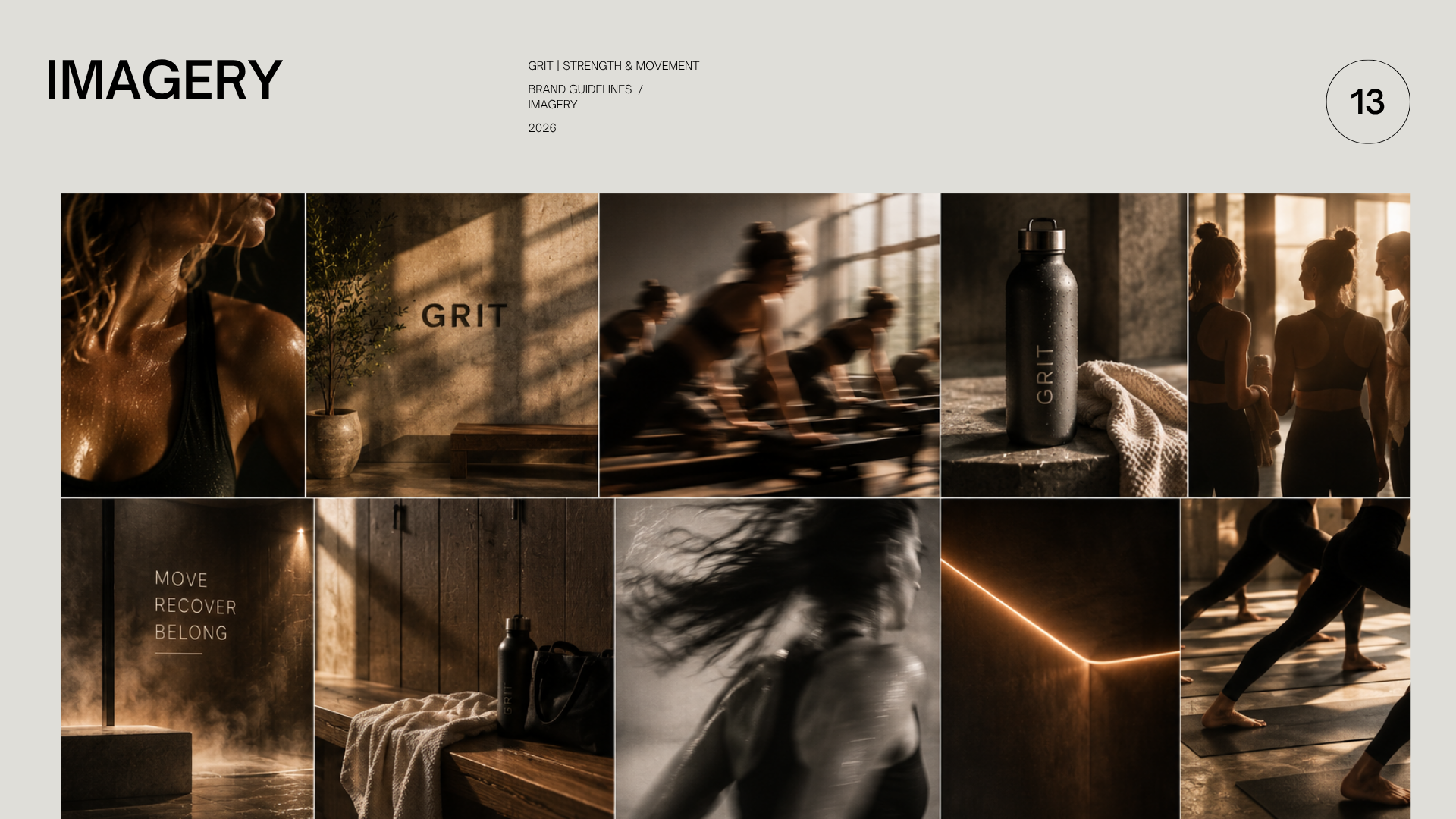
Defining what GRIT should feel like and establishing a bold visual direction rooted in performance, energy and community.
02
Identity
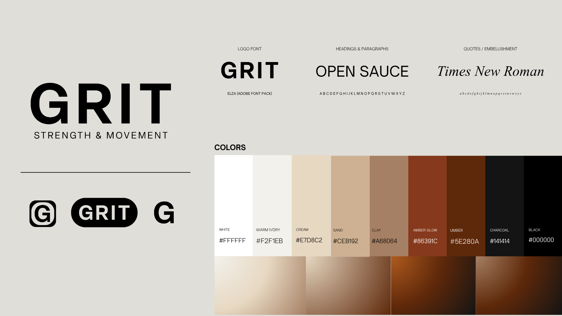
Logo / color / typography / graphic system
A complete new identity designed to feel recognizable and distinct while giving the brand more flexibility to grow.
03
Social System
Templates / content hierarchy / campaign flexibility
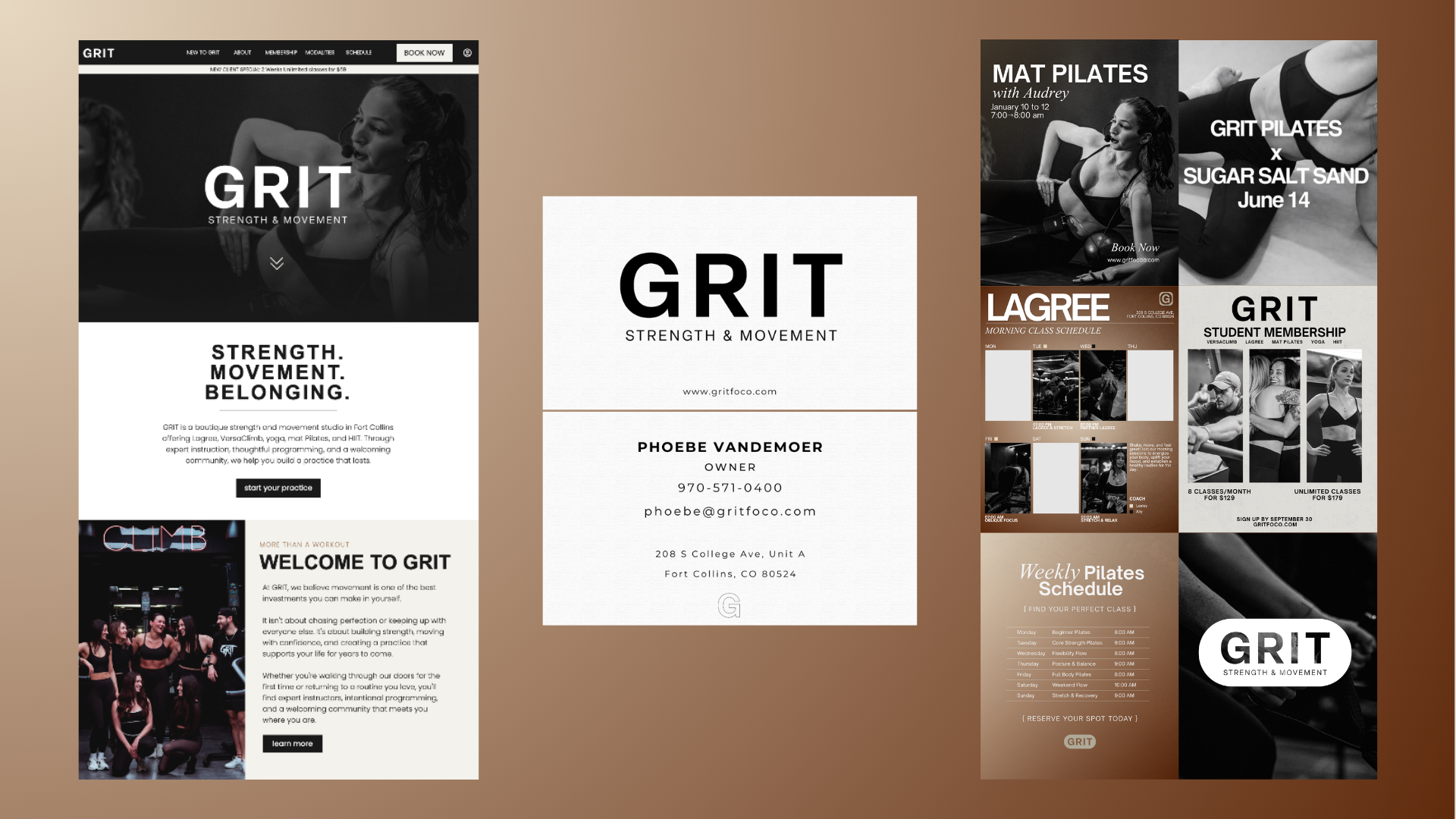
A scalable template system created to keep everyday content cohesive while allowing enough variation for classes, promotions, education and community storytelling.
04
Digital Experience
Website strategy / design / build
A complete overhaul of the GRIT website, translating the new identity into a digital experience that feels like a natural extension of the studio and brand.
05
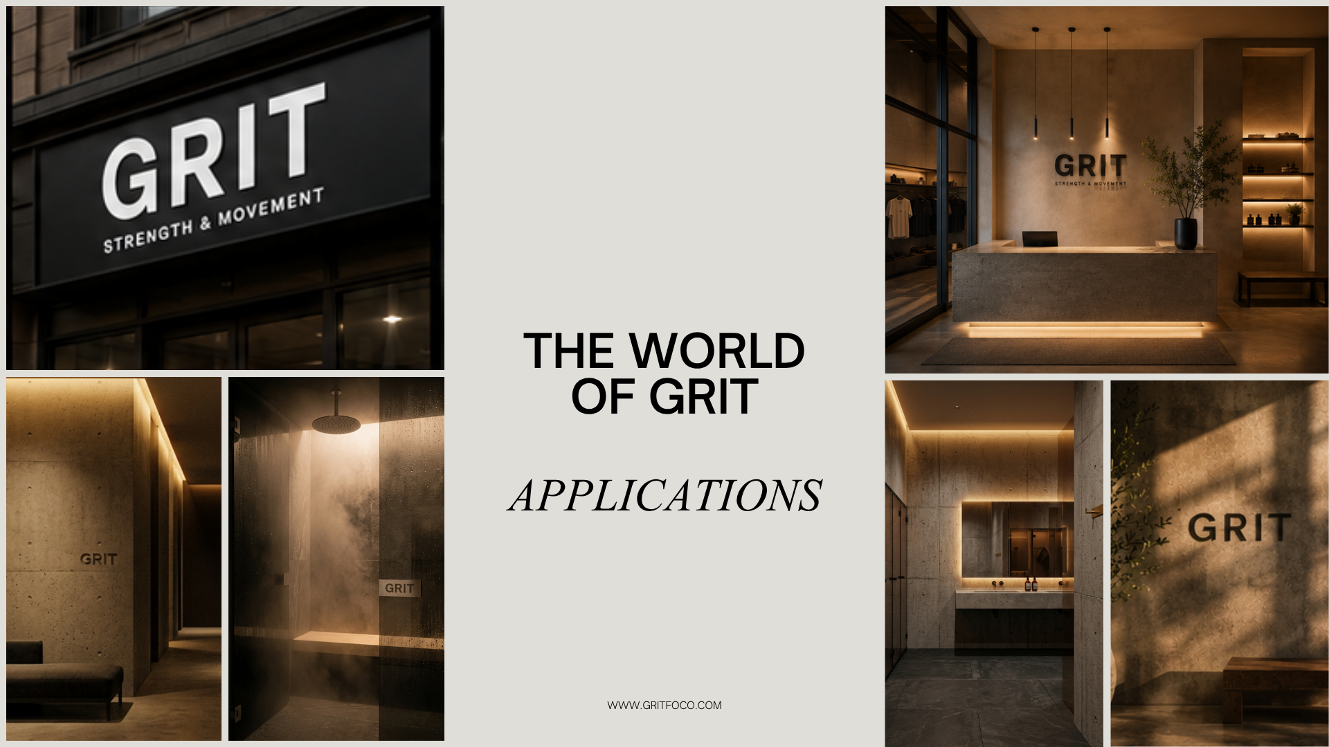
Brand in the Wild
Merch / marketing / physical touchpoints
Extending the new visual language beyond the screen into the places GRIT's community actually interacts with the brand.
06
Final System
One identity. Multiple touchpoints. Room to grow.
A complete rebrand carried from initial direction through implementation across web, social, marketing, merchandise and the physical studio experience.
Rebrand → Digital → Social → Physical
- Brand
- Identity
- Digital
- Social
- Merch